







A medical fashion brand building a new website — with color at the center of every product
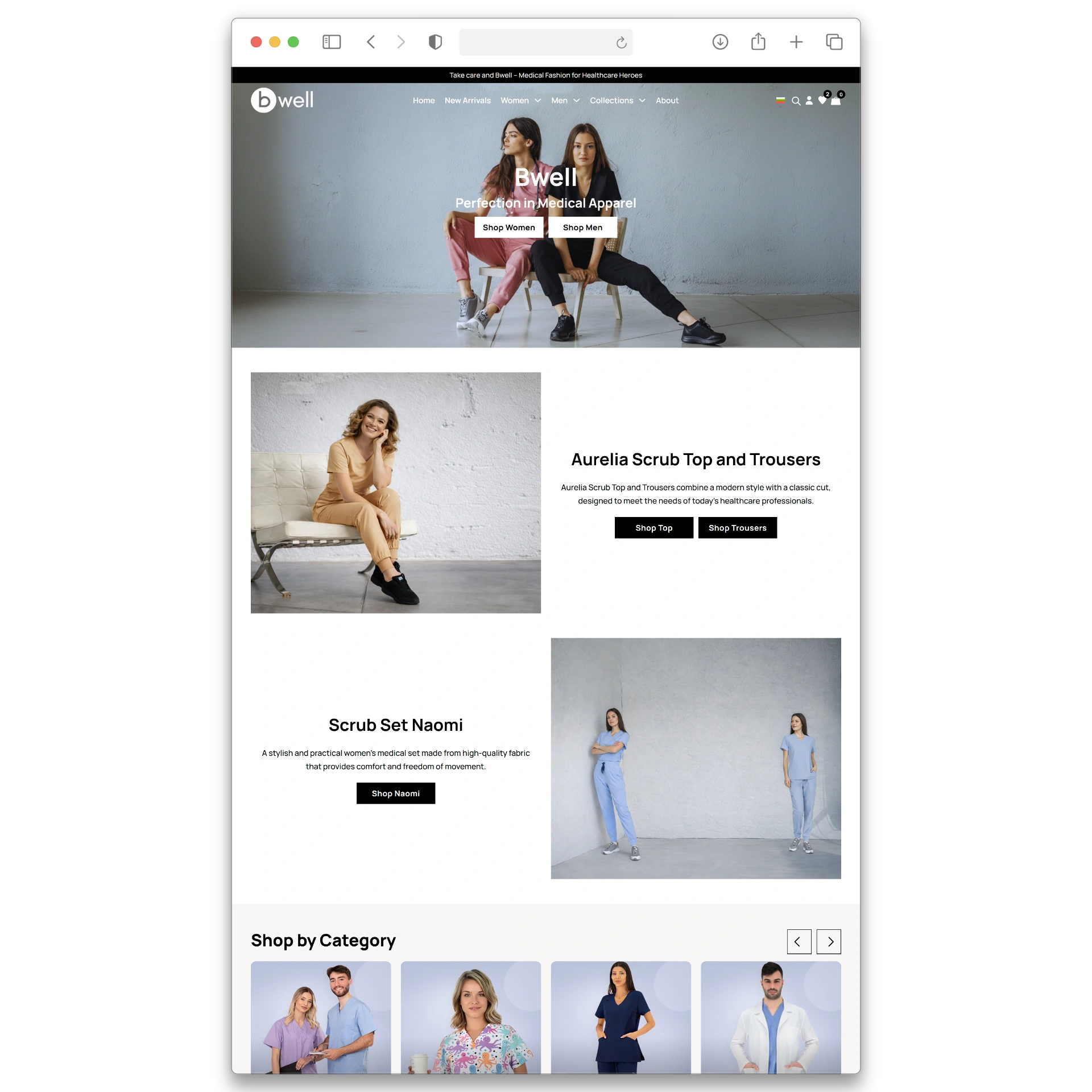
Bwell is a premium medical apparel brand selling scrubs, lab coats, and accessories for healthcare professionals across dozens of colors and collections. This was a first website, built from scratch with a single architectural principle: color is the primary shopping dimension, and every part of the site had to reflect that.
Customer developed functionalities
Average organic traffic growth in year one
Average organic traffic growth in year one
E-commerce
Web Design
Custom features
The client
A premium medical apparel brand that needed a website as considered as the products it sells
Bwell is a Bulgarian medical apparel brand selling premium scrubs, lab coats, medical shoes, and accessories for healthcare professionals. The range is built around color — Core Colors including Black, Navy, Teal, Burgundy, Royal Blue, and Ciel Blue sit alongside a rotating set of Limited Edition Colors such as Coral, Blueberry, and Azzuro. Products are organized into named collections (Basics, Flex, Cottons, Active, Allure, Prints) across women’s and men’s lines.
Bwell had a product range and a brand identity — but no website that could do either justice. The brief was to build their digital home from the ground up, with the shopping experience designed specifically around how healthcare professionals actually buy medical apparel: by color, collection, and garment type.
If you are building a website for a product-led brand and the way customers choose between products — color, variant, style — is not reflected in standard e-commerce templates, this project is directly relevant to your situation.
Industry
Medical Apparel, Healthcare, Fashion
Business Model
D2C e-commerce — scrubs, lab coats, shoes and accessories for healthcare professionals
Digital scope
Custom web design, WooCommerce store with 600+ products, integrated B2B functionality, interactive location finder
Location
20+ core and limited edition colors across more than six collections
Works with WOW Portals since
2025
The challenge
Building an e-commerce site for a product where color is the differentiator
The question for Bwell was not just how to build a site — it was what kind of site would actually serve the brand and the customers who buy from it.
The Business Challenge
Standard WooCommerce themes are built for generic product catalogs. Bwell’s range is not generic — it spans dozens of colors, multiple named collections, and two gender lines across scrubs, lab coats, shoes, and accessories. A theme that shows a single product image in listings and hides color options until the product page would have produced a site that technically worked but commercially underperformed from day one.
A healthcare professional looking for navy scrubs for their department needs to find all navy options quickly, compare them visually, and make a confident decision. A site that buries color inside individual product pages forces them to click through every listing individually — and most won’t. The commercial range of the brand would have been functionally invisible to the customers most likely to buy it in volume. Getting the architecture right at launch was not an optimisation — it was the brief.
Our diagnosis
Understanding the users before deciding how to build the website
Building a first website for a color-led brand requires answering a set of architectural questions before any design or development begins. What is the primary shopping dimension? How do different customer types navigate the range? What does the site need to do that standard WooCommerce cannot? The answers shaped every decision that followed.
finding 01
Color had to be visible from the first page a customer sees
A product available in eleven colors must present as eleven discoverable options — not as a single listing that hides its variants. If the archive shows one image and no color information, the range does not commercially exist for a browsing customer. The site needed to surface color at catalog level, not just at product page level.
finding 02
Navigation needed color as a first-class entry point
Color-led brands are navigated by color, not just by category. A customer who knows they want Caribbean Blue scrubs should be able to get to all Caribbean Blue products in one click. That requires color to be a navigation dimension — not an afterthought accessible only through filters.
finding 03
Filtering had to match how healthcare professionals actually shop
Healthcare professionals buying for a department or team are not browsing casually — they are searching with specific requirements: color, garment type, collection, technology, size. Standard WooCommerce filtering by category and price does not support that behavior. Advanced filtering was a baseline requirement, not a premium feature.
finding 04
Standard solutions could not support the required functionality cleanly
Dynamic product images in the archive loop, color-aware mega menus, and swatch-based filtering at catalog level are not supported by standard WooCommerce themes. Building on a theme not architected for these features would have created technical debt from day one. The right decision was to build on a capable base from the start — which is always easier on a new site than it is as a retrofit.
our solution
What it took to make color the primary shopping dimension from day one
workstream 01
what we did
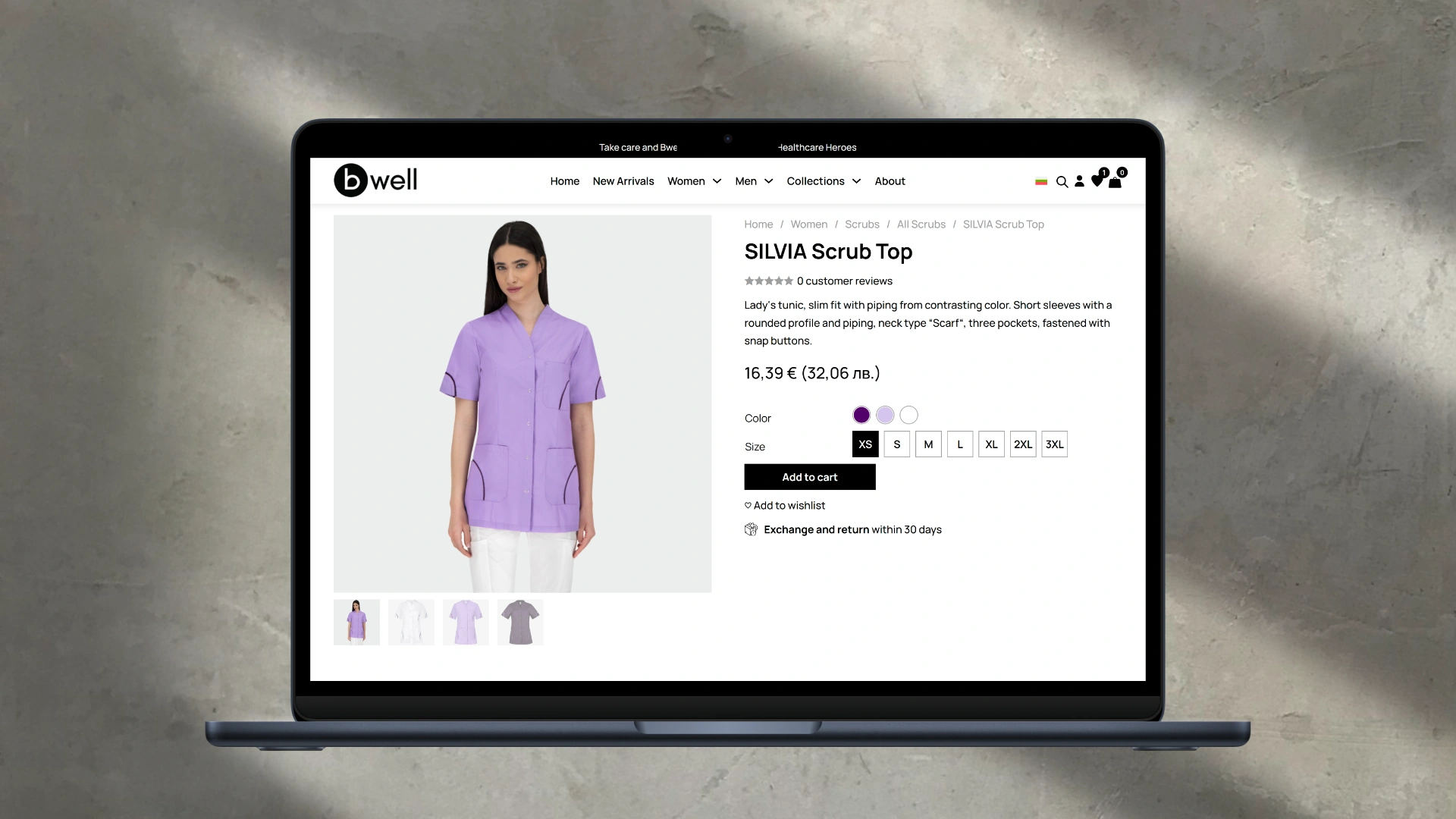
Designed and built a brand-new website on a theme base capable of supporting color-first commerce. Every template, product card layout, and navigation structure was designed specifically for a medical apparel brand where color variation is the primary purchase driver.
Starting from scratch meant choosing the right foundation rather than inheriting the wrong one. A capable theme base is what makes color swatches, dynamic images, mega menus, and advanced filters all work as native features of the architecture rather than bolt-ons. Getting this right at launch costs less than retrofitting it later.
A site where the technical architecture and the visual design work together from the first day — stable, extensible, and built to grow as the range and the brand develop.
workstream 02
what we did
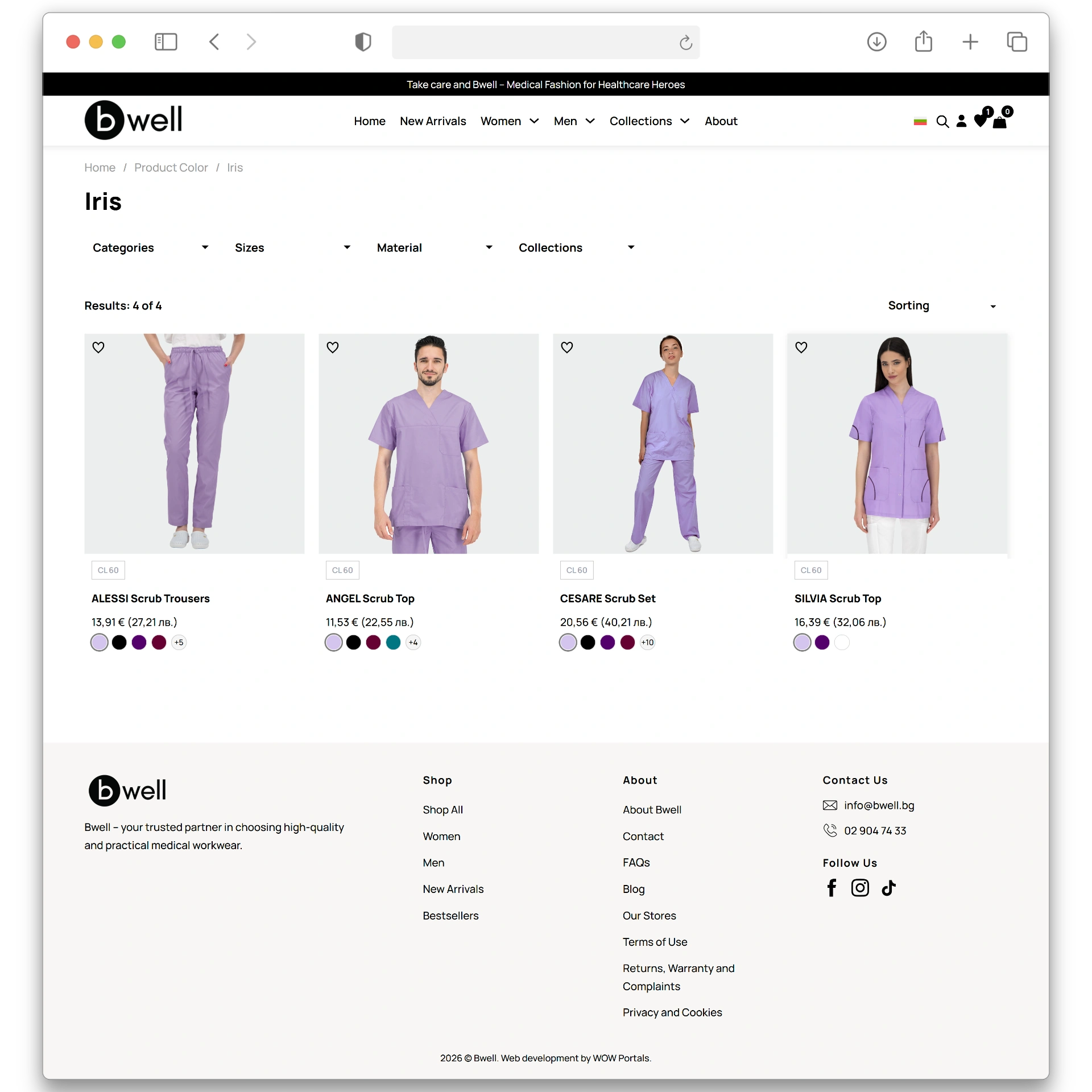
Built custom product card templates that display color swatches directly in the catalog archive — so every product shows its available color options without the customer needing to click through to the product page.
If color is the primary purchase dimension, it must be visible at the primary browsing surface. An archive that shows one image and no color information makes the range appear narrower than it is and defers purchase decisions to a later step that many customers never reach.
A shorter path from browsing to purchase intent. Customers who can see color options in the catalog make faster, more confident decisions.
workstream 03
what we did
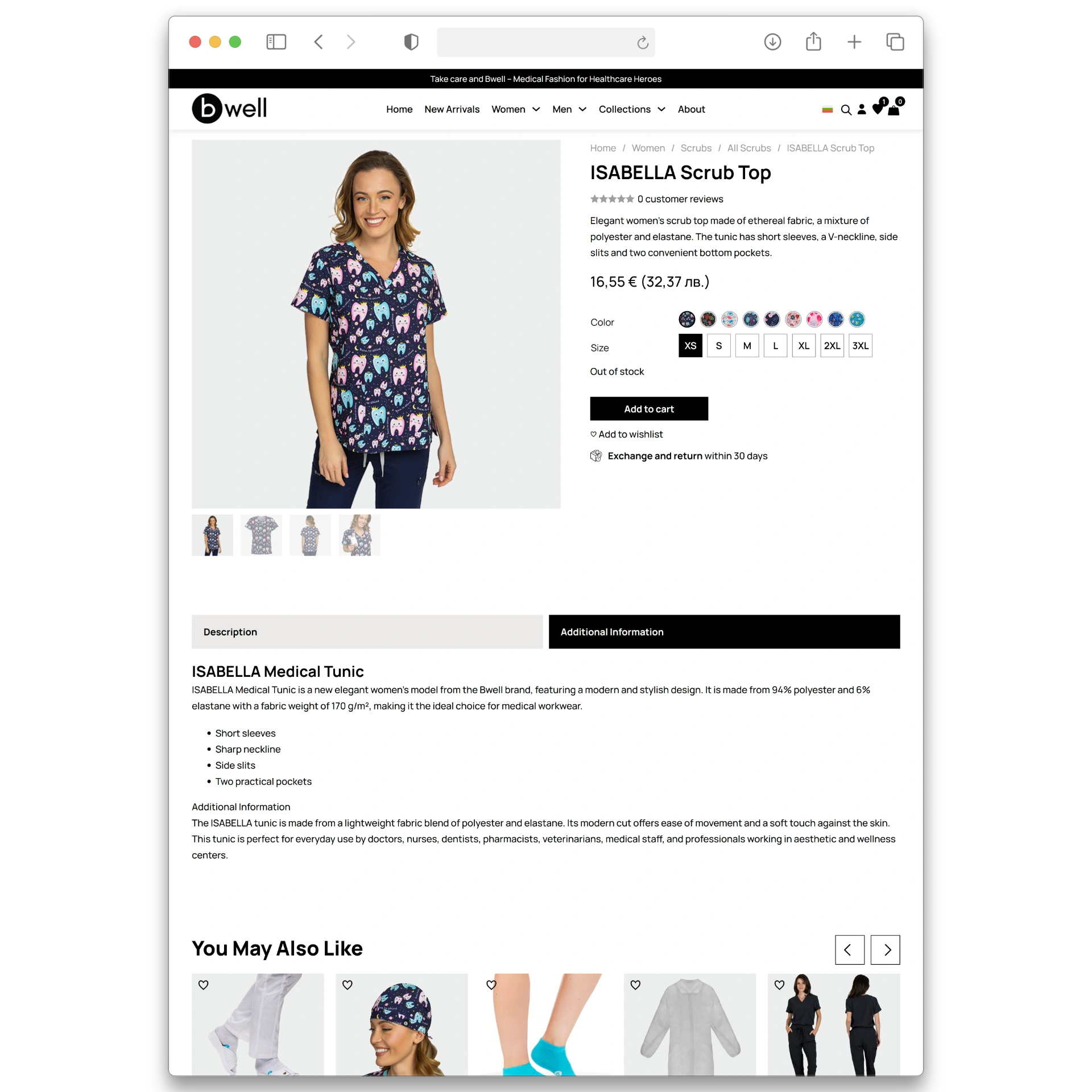
Showing swatches is necessary but not sufficient. A swatch tells a customer a color exists; a product image in that color shows them what it actually looks like. For medical apparel where precise shade — the difference between Ciel Blue and Caribbean Blue, or Navy and Royal Blue — matters, the image is the conversion tool.
Showing swatches is necessary but not sufficient. A swatch tells a customer a color exists; a product image in that color shows them what it actually looks like. For medical apparel where precise shade — the difference between Ciel Blue and Caribbean Blue, or Navy and Royal Blue — matters, the image is the conversion tool.
Higher conversion at the catalog stage. Customers who can both select a color and see the product in that color from the archive are further along in their purchase decision before they reach the product page.
workstream 04
Mega menus with color swatches and advanced filtering
what we did
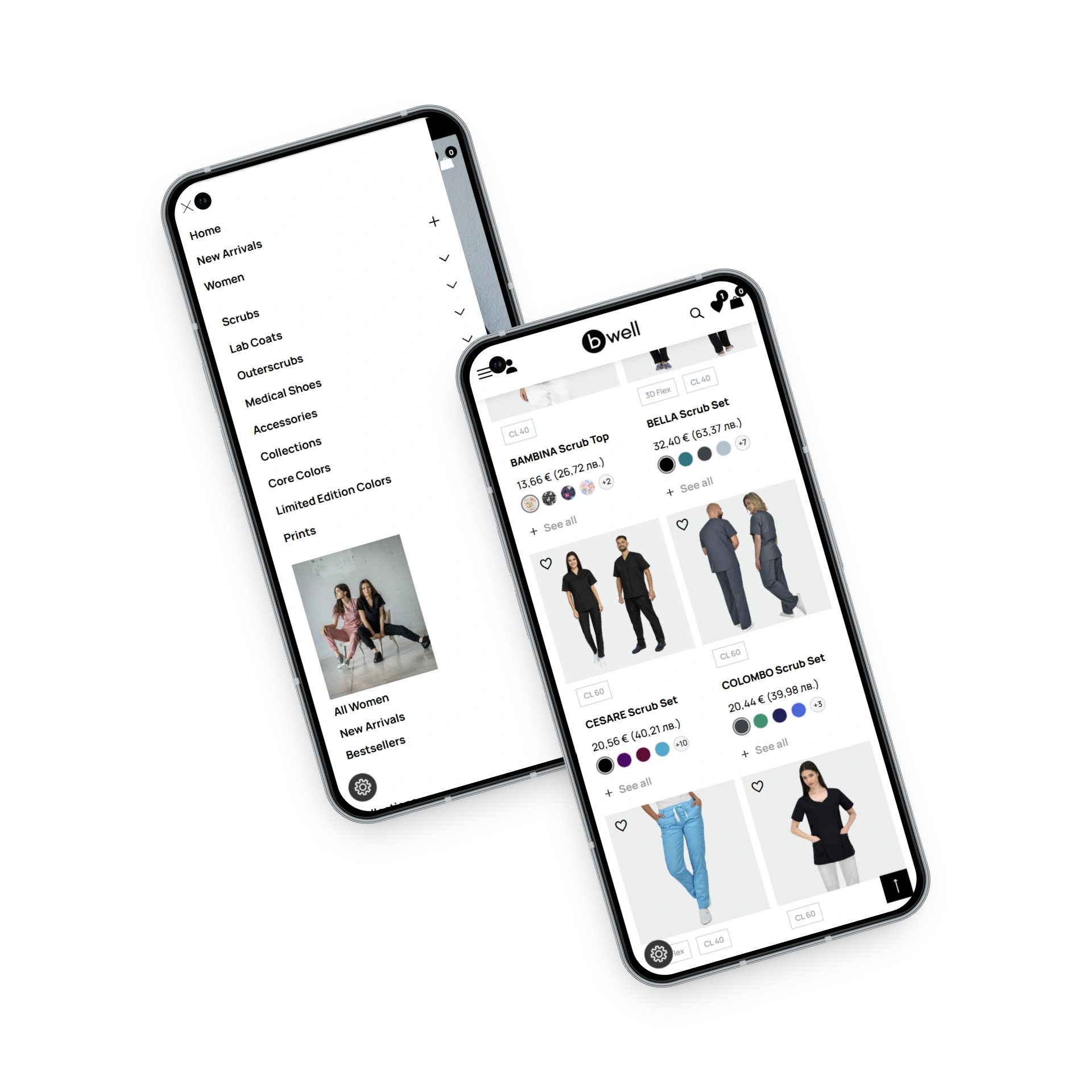
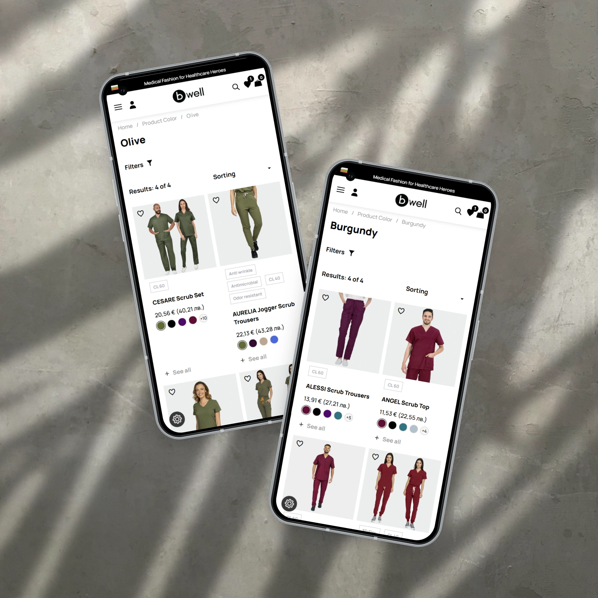
Built color-aware mega menus so customers can browse to a specific color from anywhere on the site, with visual swatches directly in the navigation. Implemented advanced filtering across the catalog covering color, collection, size, garment type, and more.
Color needed to be a navigation entry point, not just a product attribute. A healthcare professional who knows they want Teal should reach all Teal products in one click from the menu. Advanced filtering by color, collection, and size simultaneously was a baseline requirement for a brand of this type.
A site where color is the first dimension of navigation. Customers who know what color they want find it immediately. Customers who are browsing discover the range through color rather than scrolling a flat category list.
The results
From no website to a color-first shopping experience — built right the first time
Layer 01
Commercial outcomes
Bwell launched with a website that reflects the full commercial breadth of the range from day one. Products available across eleven colors present as eleven discoverable options — not as a single listing that hides its variants. The range that existed in the warehouse now exists equally on the site.
The color-first navigation architecture means that customers who arrive with a specific color in mind — healthcare workers buying department-wide scrubs in a specific shade — can find what they need directly rather than navigating category by category and clicking into individual product pages.
Layer 02
Channel and visibility outcomes
The dynamic image-per-color in the archive loop removes the primary friction point in color-led apparel shopping: the requirement to click into a product page just to see what it looks like in a different color. Color selection and visual confirmation happen at catalog level, producing a faster and more confident path to purchase.
The mega menus with color swatches and advanced filtering mean that the site reflects how healthcare professionals actually shop — by color, collection, and garment type — rather than by the generic category structure that standard themes impose.
Layer 03
Platform and operational outcomes
The site was built on a base capable of supporting the required functionality cleanly from day one — which means future features (new color ranges, new collection pages, seasonal filtering options) can be added without fighting the architecture. The ongoing subscription ensures the platform continues to evolve as the range grows.
before vs after
The complete picture
Swipe to compare →
| Area | Before | After |
|---|---|---|
| Website | No website — the brand had no e-commerce presence | ✓Custom website built specifically for color-led medical apparel |
| Color browsing | No archive — color options did not exist as a shopping dimension | ✓Color swatches visible on every product card from day one |
| Product images | No dynamic image functionality | ✓Featured image changes per color selection in the loop |
| Navigation | No site navigation to design for | ✓Mega menus with color swatches — browse by color from anywhere |
| Filtering | No filtering system | ✓Advanced filtering by color, collection, size, garment type and more |
| User journey | No digital journey — purchases required physical or phone contact | ✓Color-first browsing from catalog to checkout, fully online |
| Platform | No platform | ✓WordPress + WooCommerce — capable, extensible, team-managed |
| Ongoing support | No maintenance plan | ✓Active subscription — updates, monitoring and new features monthly |
THREE DECISIONS THAT SHAPED THIS PROJECT
Three decisions that determined whether color would work — or just appear on the site
Decision 1
Choose the right foundation at launch — not the fastest one
Building a first website always involves a foundational choice: start with a standard theme and customize, or build on a base architected for what the site actually needs to do. We chose the latter.
The features Bwell required — color swatches in the archive, dynamic images per color in the loop, color-aware mega menus, advanced filtering — are not supported cleanly by standard WooCommerce themes. Attempting to bolt them on would have produced fragile implementations that break under updates and compound into technical debt with every new feature. Building on a capable base from the start required more considered planning, but it produced a site where every feature works because the foundation was designed to support it — not despite the foundation.
decision 2
Make color a first-class dimension — in navigation, archive, and filtering simultaneously
The instinct on a project like this is to add one feature at a time: swatches first, then filtering, then menus. We chose to solve all three dimensions of the color-browsing problem together, because they are commercially interdependent. Swatches in the archive without color-based navigation means customers who want all Navy products still cannot find them easily. Color filtering without dynamic images in the loop means customers can filter by color but cannot see the product in that color before clicking through. The three features work as a system — each one reinforces the others. Implementing them together at launch produces a qualitatively different shopping experience rather than an incrementally improved one.
decision 3
Design the archive to function as the conversion layer — not just a browsing page
Standard e-commerce thinking treats the product page as the conversion surface and the archive as a navigation tool. For a color-led brand like Bwell, this model undersells the archive. A customer who can see color swatches, select a color, and have the product image update to show that color in the archive is already making a purchase decision. They arrive at the product page to confirm sizing and complete the order — not to discover what the product looks like. Designing the archive to carry that visual and informational load from day one shortened the customer journey, reduced the number of clicks between intent and purchase, and made the catalog itself a commercial asset rather than a directory.